Design System Goals
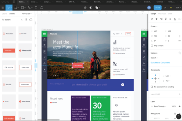
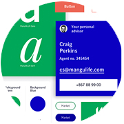
We focused on creating brand consistency and trust, strong product value, increased speed and scale, and a shared design DNA. We created a collection of reusable, on-brand, pre-designed components, guided by industry standards and best practice, allowing us to build any number of digital applications. From websites to apps, we wanted all our digital experiences to be enabled by a common design DNA, providing streamlined and efficient experiences for our customers.

Design System Discovery
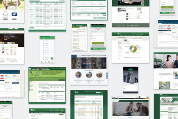
We audited existing products and sites across the enterprise, studying cases from different segments, functions, brands and platforms, offering us a view into the accumulated design debt. We identified a large number of diverse styles - color palettes, font families, button versions, and diverse behavior across basic functions. We conducted rapid research in multiple regions to understand global and regional use cases and user needs. Iterative research helped us understand whether we were successful in meeting these needs during design and development, resulting in agile adjustments along the way.

Design System Process
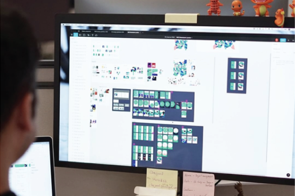
The visual direction of the user interface grew from the John Hancock/Manulife brand and evolved based on user needs and feedback. We developed variations on core components as indicated by users and created supporting documentation. We looked to Manulife/John Hancock's new brand guidelines and design principles as our North Star in everything we did and produced a system with a simple, clear aesthetic, that aligned with those values. The Connected Design System is now the digital arm of the Manulife/John Hancock Brand — providing standards, code, and guidance in all things digital.

Design System Outcomes
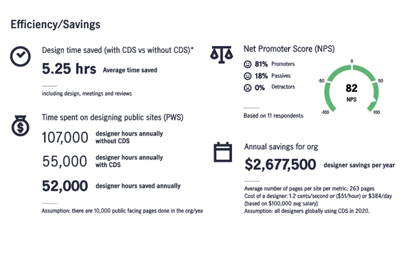
Per project: Savings of $135,360 per product/per resource or 62.5% savings.
Organization-wide: An estimate of $8,456,400 USD in annual savings for the org (based on on-shore team of 80 design resources).
“It would easily take 3-4x longer to create a page without CDS. Working with the library takes the guesswork out of design elements.
The system is so helpful and gives me peace of mind, knowing all the products we begin working on will be unified. Saves so much time!”
MAP-PC Personas
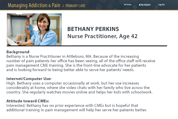
Based on user needs analysis, consisting of surveys and semi-structured interviews with clinicians, we were able to put together a series of personas, which guided the development of use cases, user flows, and all UX design.
MAP-PC Content Strategy
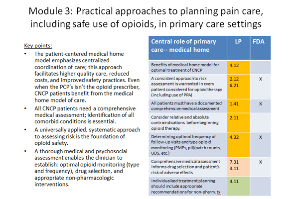
A broad range of content was required as specified in an FDA blueprint as well as other topics relating to pain management. We created a robust content matrix and pertinent content was mapped to lessons by specific learning objectives.
MAP-PC Screen Types
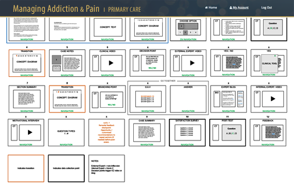
A storyboard for lesson flow was created and all screens relating to lessons were mapped out here.
MAP-PC Homepage
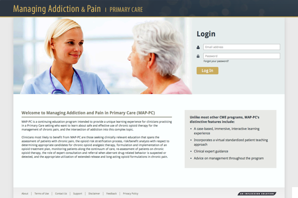
The main interface for the site allowed clinicians to login and either start or resume lessons.
MAP-Lesson Page
Users could start new lessons here, resume started lessons, or view completed lessons. Completion of required courses resulted in CME credit.
MAP-PC Video Lesson
Videos were prominently featured to support learning objectives in the lessons. Script writing, casting and directing was done in-house. We worked closely with external video talent to shoot and edit the footage.
Path to Green

Path to Green is a company-wide initiative focused on reducing risk throughout the organization. There were a number of opportunity areas, but we focused on the server patching process, which was cumbersome and ineffective, putting tech security at risk. The process consisted of initial research, current state journey mapping, collaborative design sessions, a comprehensive service blueprint identifying areas of opportunity and a roadmap for improvement.
P2G Research
We conducted semi-structured interviews with server owners and tech help desk staff to learn about their key issues, and flesh out key process activities, including challenges and opportunities. Research yielded rich cross-disciplinary process information allowing us to formulate a clear view of the over-arching server patching process.
Co-creation Session
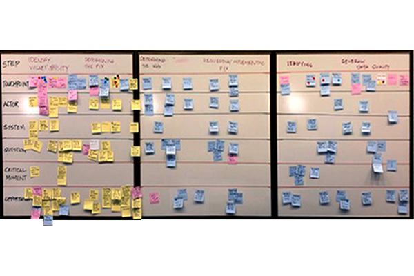
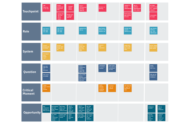
We held multi-day sessions with key participants, reviewing key themes from our research, enhancing these issues through team participation. The team worked collaboratively to create a Service Blueprint. We mapped the system owners’ end-to-end process, including touchpoints, roles, front and back-end systems and critical moments.
P2G Service Blueprint
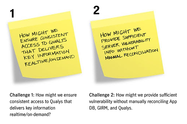
The service blueprint allowed us to view areas of friction and disconnect. We were then able to prioritize these issues based on importance and difficulty, converting top issues into “how might we statements” in order to effectively frame key challenges to solve. These top issues formed the basis for the project backlog.
P2G Outcomes
As a result of the discovery, system owners were enabled to report their own vulnerabilities and create their own asset groups. New tags were created in the tracking system, so app owners could view their own team’s servers — a key point to getting to a steady state process. The blueprint also helped the team to create a comprehensive process document on reporting. These process guidelines now serve as a roadmap for the app teams and support staff as they undertake this process.
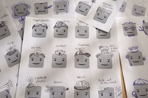
Headzup Concept Sketches
A reward system within the app is based on gaining access to new faces and hairstyles as the user achieves their goals. Team members, including both designers and non-designers, produced hundreds of idea sketches as badges to be included in the app. 50 styles were chosen and offered to users as they met their goals.
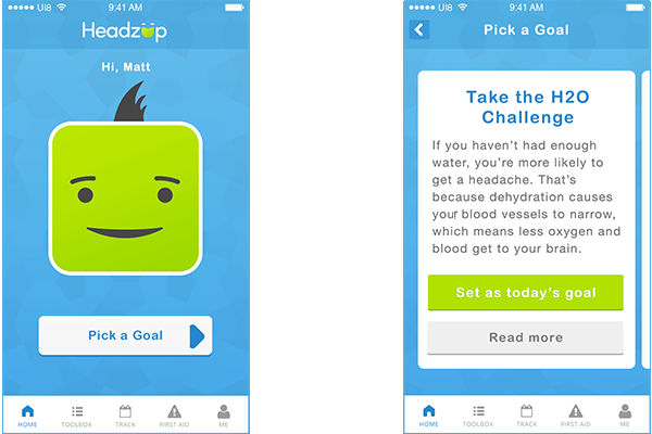
Headzup Mobile App
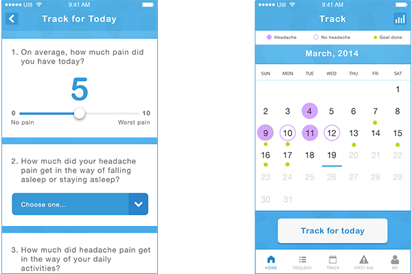
A main focus of the app was to set daily lifestyle goals. A variety of goals were offered with bite-sized descriptions and more educational material to view if users were interested in a goal. Teens were encouraged to select one goal per day.
Headzup Mobile App
Teens were encouraged to track the completion of their daily goal and if the goal was met, they could select a new goal and claim a reward. They could view their progress over time via a calendar-based tracking system.
MyStudentBody Brand
The MyStudentBody brand needed to appeal to incoming college freshmen. Brand elements include a fresh palette, distressed backgrounds and a custom handwritten font. Applications of the identity ranged from the application itself to door hangers to peel off stickers.
MyStudentBody Website
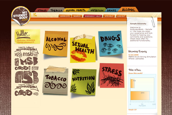
This comprehensive online application covers everything from stress to sexual health. The site offers bite-sized assessments to help gauge outcomes, and educational resources like online learning modules and video peer stories. Extensive user testing was done with college freshmen on UI and content tone.
MyStudentBody Direct Mail
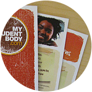
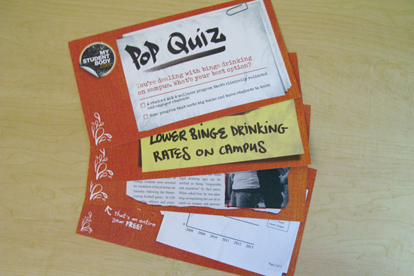
A direct mail campaign was aimed at college administrators and focused on their main topics of concern. Oversized postcards with a series of eye-catching messaging and graphics were sent out to hundreds of administrators nationally.
MyStudentBody Tradeshow
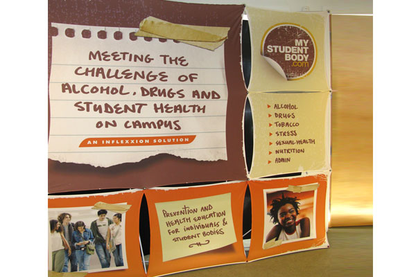
Tradeshow materials were created for academic conferences, aimed at college administrators. Oversized panels reflected the MyStudentBody brand with large close-cropped photos, custom text and an approachable feel. Every aspect of the user journey was considered and on-brand.
ASI-MV Brand
The ASI-MV brand identity takes a cue from its parent brand. The blues and greens are a nod to science and health. The subbrands within the product line are consistent with overall brand and variations speak to differences within the target populations.
ASI-MV Website
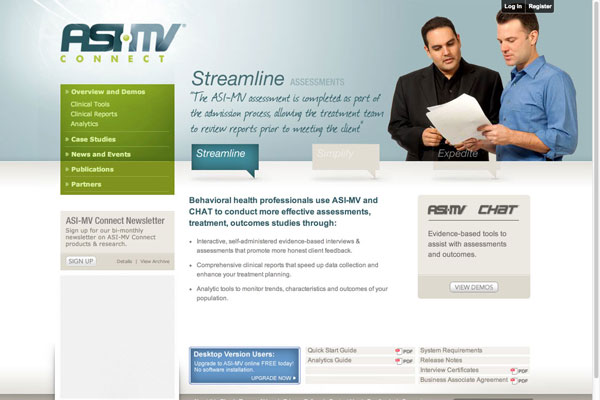
The ASI-MV site provides marketing information as well as a client login. The site allows clinicians to set up, administer, and track assessments for their substance abuse clients. Organizational administrators can monitor clinician and client activity in a granular or aggregate way.
BHI-MV Video Demo
This demo video was created for a last-minute tradeshow. Audio was recorded in-house and animations were created with a combination of stock video, stills and screenshots. It introduces clinicians and organizational administrators to the BHI-MV a new behavioral health version of the well-known ASI-MV.
ASI-MV
Collateral
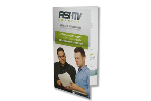
A full line of collateral was created to support sales/pre-sales of the applications. Brand identity was consistent throughout, including postcards, brochures, and tradeshow materials.
